


Homage to Colour | 02
Exploring Colour Combinations with Josef Albers

When selecting colour combinations, I often turn to Josef Albers’ Homage to the Square series for inspiration.
Between 1950 and 1976, Albers created over 1,000 paintings within this series, each composed of four nested squares in varying colours. His work explores how colours interact, influencer one another, and shift based on their surroundings — showing just how much context changes the way we see colour.
“Colour, as the more relative medium in art, has innumerable faces or appearances. To study them in their respective interactions, in their interdependence, will enrich our ‘seeing’, our world-and ourselves.” — Josef Albers
In this new Substack series, I’ll be selecting paintings from Homage to the Square and curating reference images that reflect their colour palettes. Merely a fun little exercise for your viewing pleasure <3
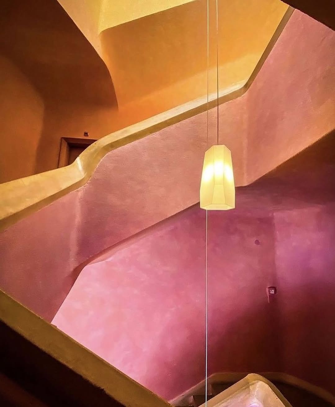
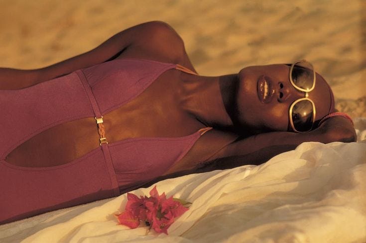
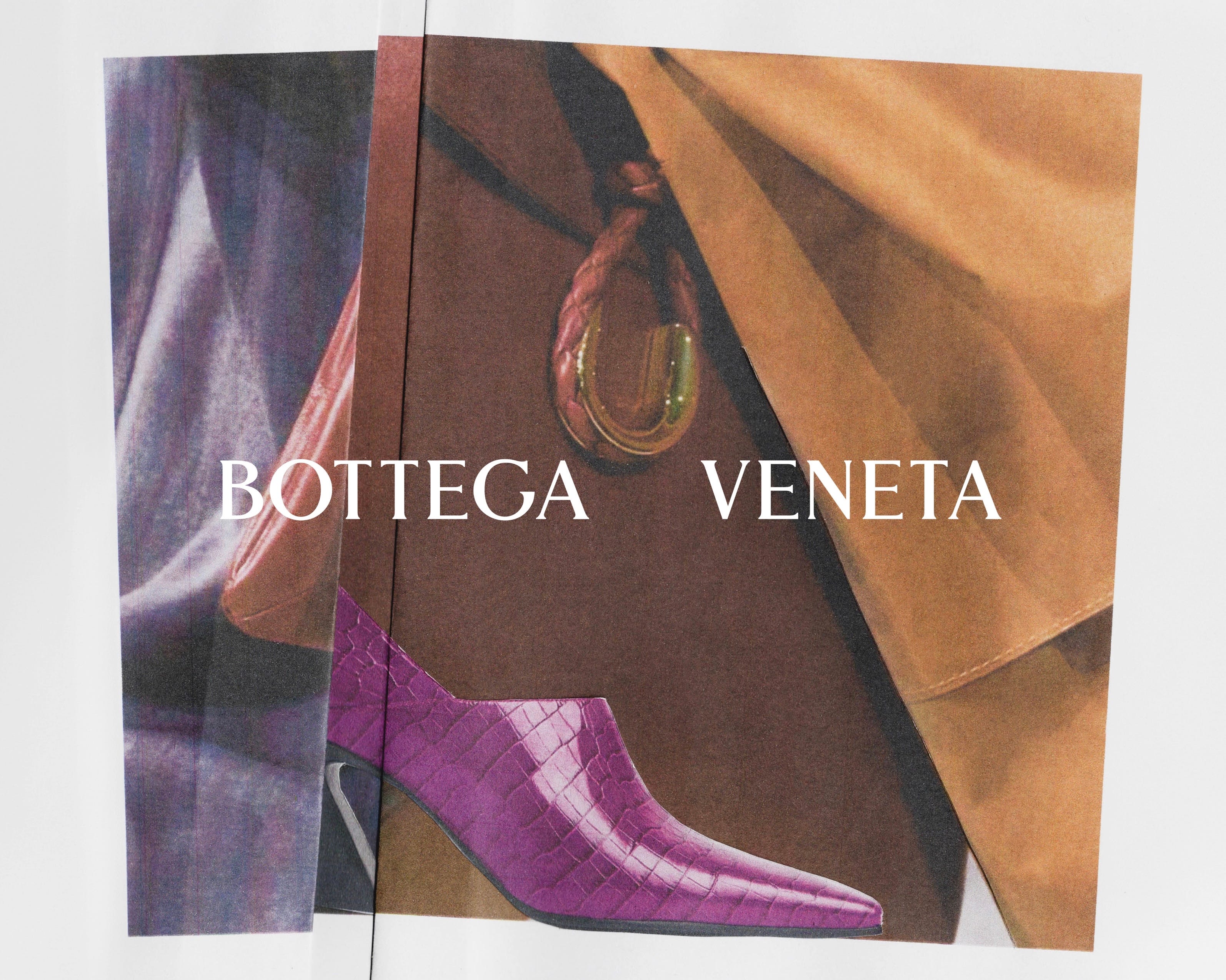
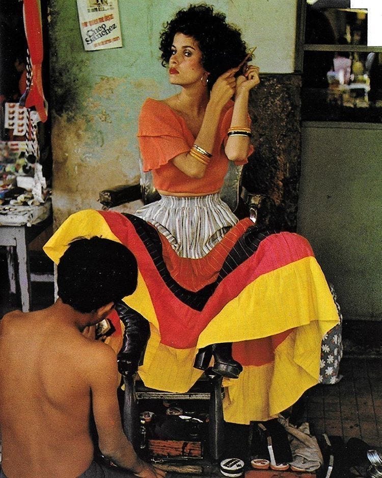
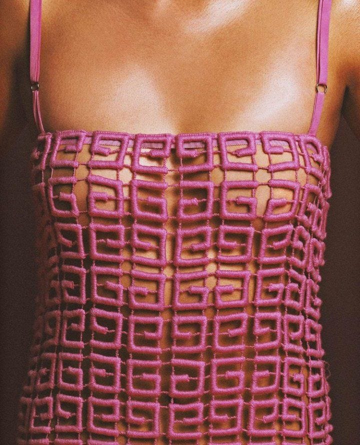
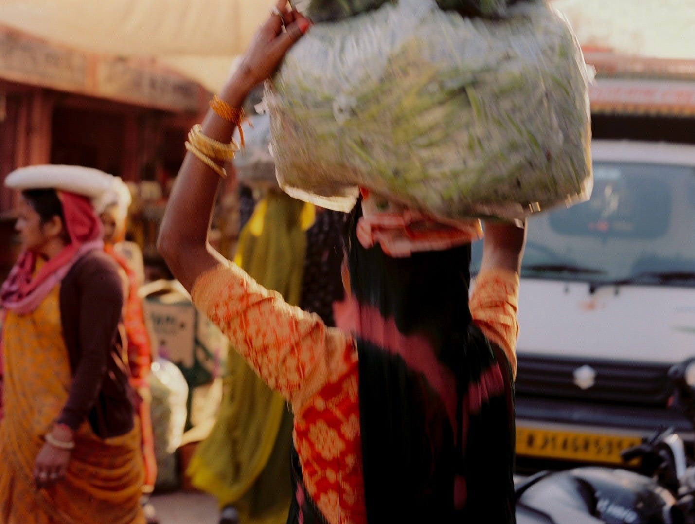
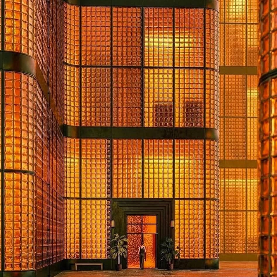
Reigniting this series with a selection that feels as hot as the heat we experienced this week. I give you…Josef Albers’ La Tehauna
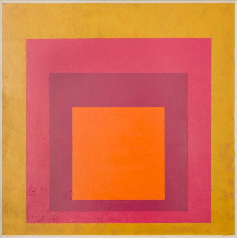
At the centre, a fiery orange square radiates an inviting warmth. It feels like the heat of the sun at it’s peak, bold and electric. Wrapping around it is a deep magenta, rich and velvety, like the flesh of a ripe plum or the saturated hue of bougainvillea in full bloom. From there we transition into a raspberry pink that soften the intensity but keeps the energy alive, like the glow of a sun-washed stucco wall. The outermost square is a dusty, golden yellow. It feels earthy and weathered, like it’s been touched by years of sun and wind.
As one, this palette feels both grounded and celebratory, evoking warmth, tradition and vibrancy.
Layered, radiant, unforgettable.


loveee these colours together!
Can’t wait to see what’s to come from this series!